I would like to share my technique for painting a pet portrait, from a poor photograph, In this article, I will be painting brown fur, in acrylic paints. The method is painting in layers; many many layers. I am not fortunate enough to have large groups of time, to paint, so the painting really had time to dry, in between layers and took approximately 3 weeks to paint. This is a commission portrait. The client borrowed the photograph, without her boyfriend knowing, long enough for scanning. She chose this photo, because it is of a dog, her boyfriend had, whom has "passed on". He carries it in his wallet, and pulls it out, often, to look for himself or to show others. The photo and Stanley meant a great deal to my client's boyfriend. The reference photo is a portion of a larger photograph, which was cropped in, to just feature Stanley. It's an old photograph, and in rough shape. You can get a good sense of what steps were taken, with the painting by reading the descriptions and looking at the photos. Some steps are the same process repeated, building on the previous layer of paint, so at times, the photos may seem the same. If you look carefully, you notice the differences. I am sorry about a couple of the images, but despite their quality, you can still see what is occurring. |
|
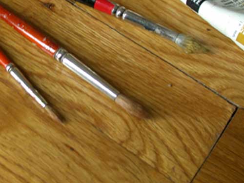 |
The brushes were just three:
All the brushes are used, during all layers. I feel most compfortable with a brush that has been well used and moves easily in my hand. I grab which ever one achieves the look I am trying to achieve. Such as; a wispy looking fur, I'd use the worn out bruch. For a more of a clean line, I'd select the liners. Your brushes don't need to be the same as mine; use the brushes with which you are most comfortable. It's not the brushes that paint the painting, it's the artist. |
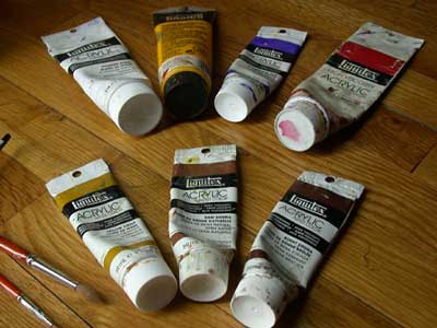
My palette for this painting is limited:
|
|
The surface is a hand-stretched canvas, primed; 16x20. I like stretching my own canvas. Not only can the canvas be a custom size, I know that it is well done and will shrink and stretch, straight. I thin my acrylics and paint in thin watered down, layers. Keeping things simple, I use only water to do the thinning. Others may find a product like a glazing medium or a matt medium, to thin the paint. I never really have tried them, myself. When mixing my colors, I try not to over-mix on my palette. That tends to flatten and deaden the colors. When the color is allowed to mix on the canvas, the colors are much richer and really come alive. I chose to leave black out of my palette because I feel it's a very flat and lifeless color. Remember the simple rule that black isn't absent color, but instead, all colors, That's the black I use. And, when not over-mixed and viewed under certain light, the black can reveal such depth. |
|
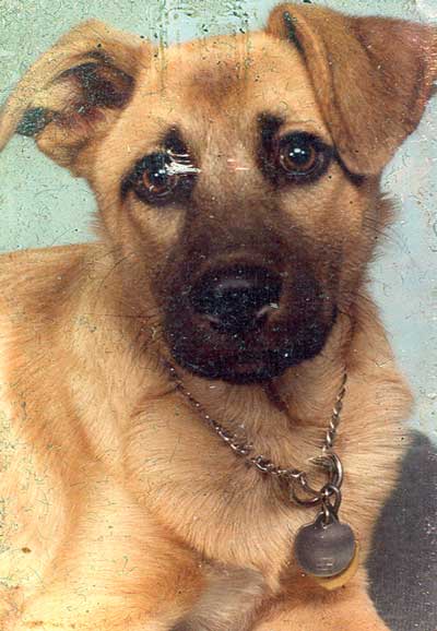
| This is the reference photo of Stanley. Although the quality isn't good, it's still a strong composition and the colors are fairly accurate. Most importantly, it's the only photo of Stanely! |
|
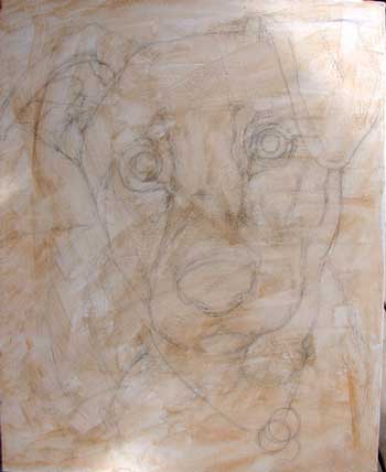 |
STEP ONE In step one, I covered the entire canvas with burnt sienna, to take away some of the canvas' brightness. Used, is the second to last of the dark colors in the palette and makes a good first layer. |
STEP TWO The background color has been suggested. This helps me to start to adjust the colors, in my palette; see which colors work best, with each others. Since I usually use a limited palette of the same colors, it's not hard for me to get this stage finished. |
 |
 |
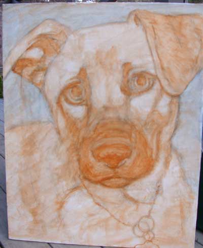
STEP THREE In this step, I am adding some of the darker colors, of the dog. By doing this early on, I can obtain a better sense of depth and the balance of the composition. |
Here, I am still working on the darker areas, really making them pronounced. In the highlighted areas, I have added a bit white to obtain the extreme value of the dark. After a few layers, of the dark, the painting will sit for a many hours, to dry. Since I don't have "lots" of time, to paint, I have a chance to step away, for a while and let the layers blend as they dry. When I come back to the painting, not only am I looking at it, with a fresh eye, I am also dealing with a dry piece that really shows the layers together. |
 |
 |
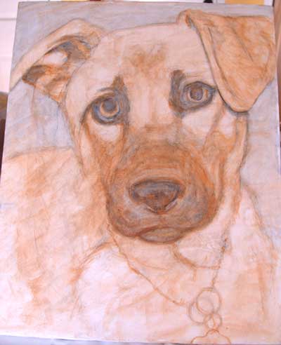
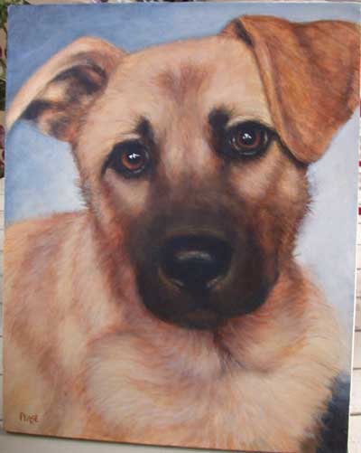
STEP FOUR (Unfortunately, this is a very bad photo, because it makes the painting look more golden-yellow, than it really is. But, in the interest of keeping a decent photo-log, I didn't want to continue without photographing, first. That meant depending on normal indoor lighting. Sorry.) After quite a drying period, I noticed that the painting looked a bit top heavy, compositionally. The nose seemed too centered and the eye had trouble traveling past such a large mass. To help eliminate this, the bottom right corner was made a bit darker. As for the dog, I also noticed that the tip of the nose was a bit too small. Did a little refining to the flat ear and worked on Stanley's overall coat. |
STEP FIVE Here, I am still blocking in the fur. I am working darker than the final coat will look, because this represents the bottom-most layer of the Stanley's fur and isn't effected by the lighting. At this point, I am not trying to cover the entire canvas surface. Just portions, with thinned paint, reserving or adding white, when necessary to maintain a nice glow. |
 |
 |
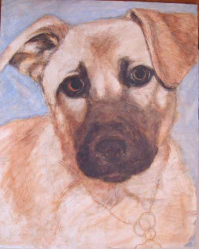
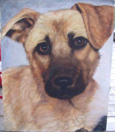
STEP SIX This shows Stanley, after a few layers. Notice that the fur looks a bit softer and not as blotchy. That is accomplished after many thin layers are applied, and not a couple of thickly applied layers. I decided to eliminate from the painting, the chain and tags. Normally, I included such things, but this time, I thought it distracted too much; compositionally, it competed with the bottom right corner.
|
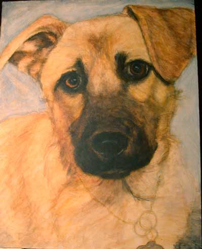
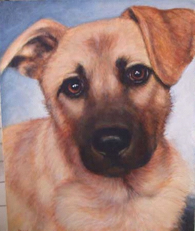
Heres the final painting, after a few more layers and a bit more highlighting. An advantage of the layer painting is the way the other layers shine through. By mixing the color on the canvas and painting in with thinned paint, you are preventing the colors from becoming muddy and allowing the glow from beneath to come through. |
 |
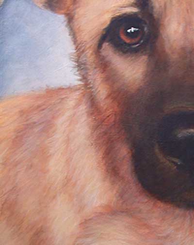 |
Here's a closeup, of Stanley. Notice how I didn't try to draw each and every hair. I just let the layers show through one and other, implying the furriness. |
Thank you, for reading this article. I truly hope it was helpful and you can see how it is, I achieve the likeness of fur. Please feel free to send me a private message, email me, or post comments on this article. I would love to hear from you. |
|